Documenting my work for my Senior Capstone
Winter Quarter
Introduction
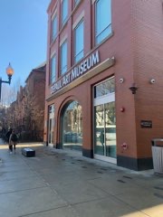
For my senior capstone class at DePaul University, we were assigned to develop design solutions for the DePaul Art Museum, or DPAM. The museum had issues with the fact that people don’t know much about it, or took interest in a way that they never came. I phrased it as follows: “They are Sylvester Stallone, we are Burgess Meredith”, and we are training for the championship fight against Ivan Drago. Or Apollo Creed. You know, I’m making that connection without ever having watched Rocky.
Aiming to design an experience that would expand the audience’s expectation of artistic canon, the DPAM is my first taste of “real” UX design processes, the challenges involved, and how they are overcome.
Design Research
Design Justice Principles
The first thing that the class was introduced to is the concept of design justice. Like everything in society, design is inherently political. A moment from the reading that stuck with me was the moment wherein the author had to be searched because there was no non-binary option to scan the author while they went through airport security. There are a couple principles that initially stood out within the concept of design justice that I was cynical about. For example, I considered that DPAM’s goal of “expanding the artistic canon” was questionable from a design justice perspective because the people who decide what is and isn’t part of a canon are often not alive at the same time the art was created.
Stakeholder Mapping
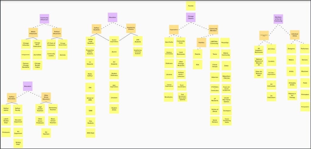
When we first visited the DePaul Art Museum, I was struck by how much of an underdog situation that we were dealing with. The DPAM has a collection of over 4,000 items; small, but still significant. In terms of mapping stakeholders, the process was a simple brainstorming session. Just come up with people who might be interested in the museum, indirectly or directly.
Stakeholder Interviews
The first portion of the capstone consists of user research, and my user research focused mainly on my friends and family. The first user interview consisted of an interview with my father, an attorney and musician who provided a general insight into what a museum visitor looks for.
Afterwards, he discussed that he had to figure out some of that stuff on his own. The second interview was conducted over text message with a friend of mine who had visited the DePaul Art Museum. I sent them a questionnaire, and this is how they responded (no alterations made).
- What is your name, age, and occupation?
- Name- DEVIN Berzon. AGE-19 work- student center at DePaul
- Describe what led to your visit to the DePaul Art Museum.
- For SPANISH 101, I had to visit the MUSUEM to study the Latinx or Latin related paintings and write a report of what I learned. I spent approximately 20 mins there and had to take a photo in front of a painting for proof that I went. It was an interesting experience because I learned the background of each Latinx painting.
- Before visiting, what preconceptions did you have about the museum?
- Preconceptions about the MUSUEM was that it would be boring, however as I studied the exhibits I realized it was quite fascinating.
- What did you observe during your visit? What kind of people did you see?
- I observed a plethora of artworks, all different backgrounds and meanings for each. I observed mainly the people that worked there, but there also was a few rather large groups touring the MUSUEM.
- Do you prefer museums to make your choices for you? Or to make your own path through the museum?
- I prefer a mixture. I would have liked for a tour guide to tour and show me around as it provides structure rather than having me figure out it myself. However, making my own path is also nice so I can focus on the reason I’m there along with what I am comfortable with.
The third interview was conducted with a family member who lives within Lincoln Park. They had a wide variety of experiences in museums all over the world, and yet didn’t know where the museum was. I’m not even sure I gave the right directions.
UX Research
Josh Tsui and Toni Witt
I am not the type to listen to a speaker who I feel like has nothing interesting to say, to be honest. I was mostly tuned out of Tsui and Witt’s presentations because I really wasn’t interested in what they had to say. I did take interest in the creativity of the space and how they were wrong because they didn’t listen to common sense ideas and instead went for something stupid.
Design Precedents
So, I have a background where I don’t have much feet on the ground in terms of the types of experience that generally inspires people. Design ideas, for me, come more strongly from fiction and my own past experience because the collective ideoforms of my solutions is already in my head. One of my ideas that I will talk about later was basically inspired by Blade Runner.
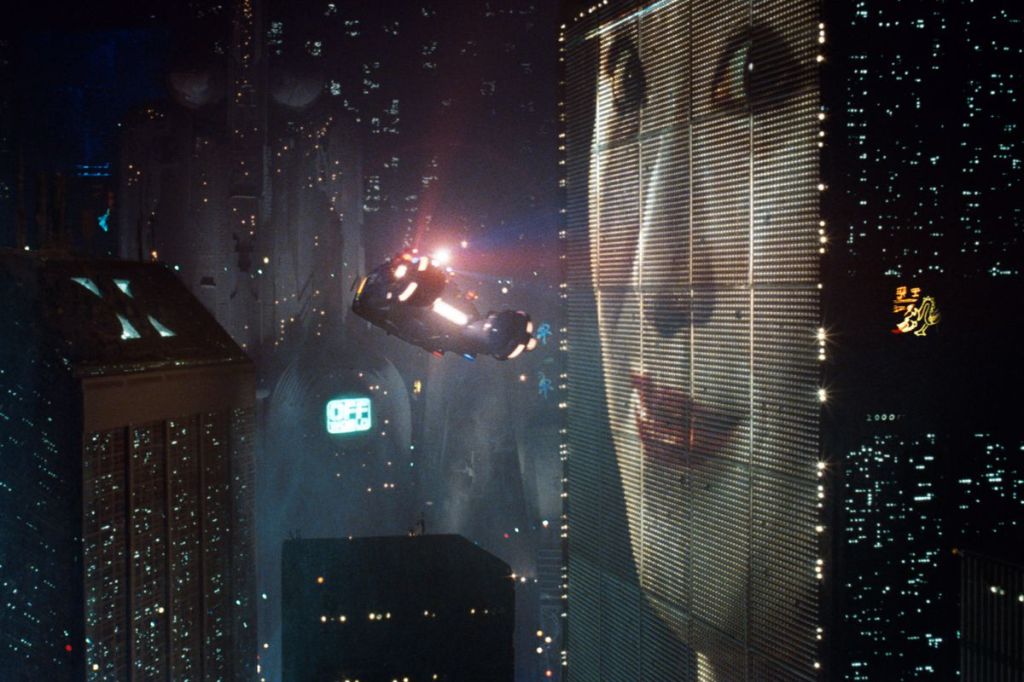
Now, as you’ll soon see, there is very much a difference between what I had in mind when I pitched the idea to DPAM and what is there, but the idea of it was communicated to me by cyberpunk like Blade Runner.
Pitching and Brainstorming
The first part of coming up with our designs was to take the research we had done and aggregate it into a couple different areas of research. The class had convened into groups and developed questions based on the research we had collected. I can’t quite remember what the questions were and I missed half of class due to an incident involving a shortage of ADHD medication, but this eventually coalesced into five or so areas wherein solutions could be focused: the DPAM exterior, takeaways, remote experiences, on-site games, and outreach. I decided to be part of the team that focused upon the DPAM exterior.
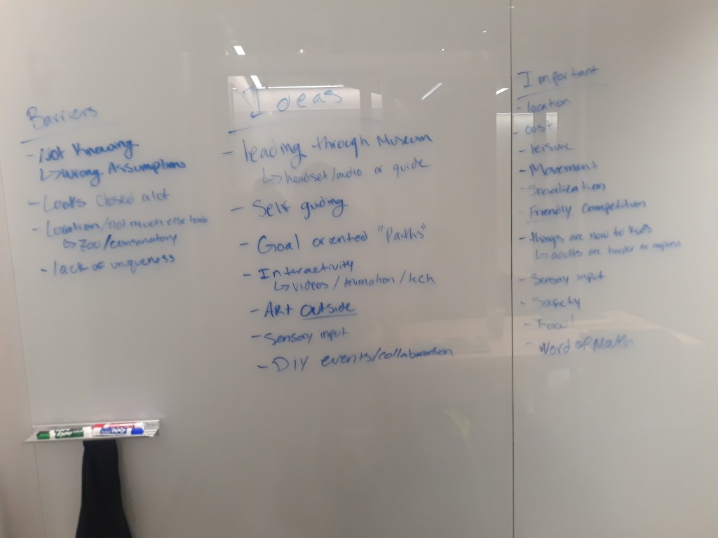
Brainstorming
The first step involved with the process was collecting the ideas. I was part of a group, and this photo contains our collection of ideas:
DPAM Exterior
There were two approaches to the exterior of the DePaul Art Museum that my group thought of: the front and the side. The overall goal was to bring the interior of the museum to the exterior in order to solve the problem of no one really knowing that it exists. Several mockups of the front and side were made because of this, and these became essential to our pitching. To convey our ideas, we needed to fake them. We also came up with a kick-ass hashtag to promote the DePaul Art Museum’s proximity to Fullerton Station: #ArtAtTheL. Pretty good, huh?

In figure one, the facade of the DPAM is used as a space for moving pictures projected onto the glass of the facade that would draw attention to the museum, with potential for different approaches at different times of day. During our user research, we found that there was a distinct lack of…well…distinction in terms of making the DPAM stand out from the surrounding area. I used Photoshop to create the above image as a mockup of what projecting an image onto the glass would look like.

This mockup is less good, but I still like the idea behind it. A virtual contributory mural would be created that would be accessible from the platform of the Fullerton train station. While conceived as a virtual version of the type of street art that went on at a venue such as 5pointz in New York City, several challenges were faced, resulting in us dropping the idea.
Pitch
When we pitched the ideas to the DPAM, two important things came through from the presentation. The first is that we abandoned the idea of the front. The front had turned out not viable, due to the cost of projecting something onto the nice glass screen in front. Throughout our experience designing the exterior of the building, the question of “what space can we use to design” had dogged us. We decided to focus upon the side of the DPAM in order to really make our ideas come into focus. The second is that we decided that they should apply some general things to the front of the building. Spruce up the plants, put a big sign in front that said free, and change the title. Thus, we decided to focus our focus on the ideas that involved the side of the building.
A constant concern in UX is how ideas don’t always work out. Things happen that are great in theory, but constraints that weren’t previously known suddenly appear. This was a common discussion we had in our group: that the DPAM didn’t really know what they wanted, and that our constraints weren’t entirely known.
Refining Our Ideas
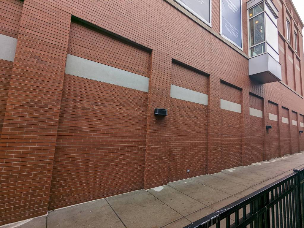
This problem of us not knowing our constraints persisted throughout the second half of our senior capstone first session. To address the problems found throughout the first pitch, we decided to pivot to the side and design for it, utilizing the area wherein the Fullerton Station connects to the Depaul Art Museum.
Pivoting To The Side
As with any design project, the feedback we received affected our ideas. As mentioned, we could not do the front in a way that DPAM found acceptable due to cost concerns. So, we developed a different idea for the exterior that focused solely on the side.
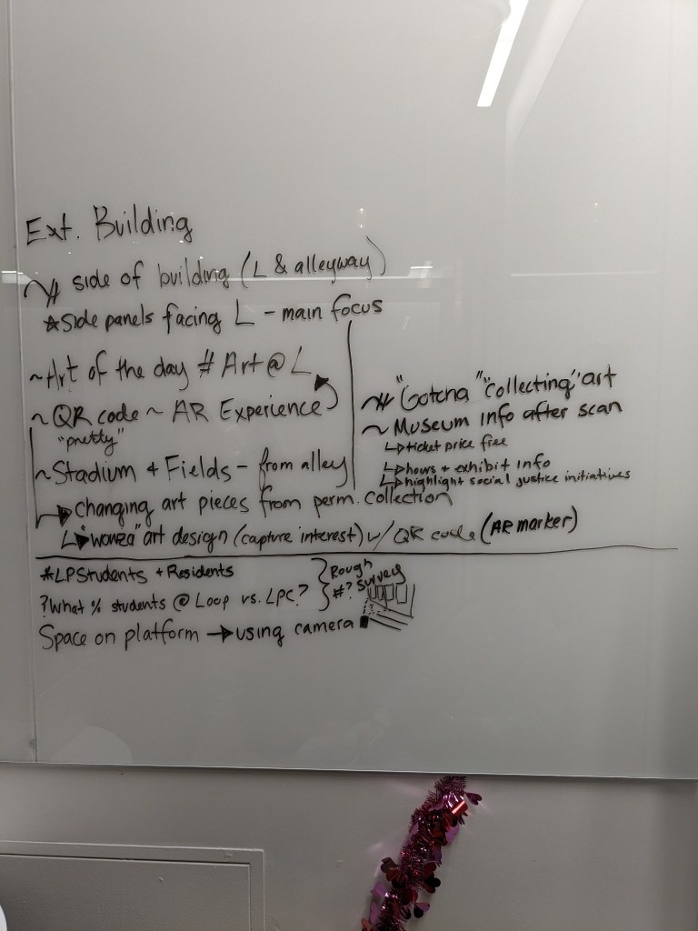
Our approach would utilize all of the area to the side of the building facing the Fullerton train station, utilizing two spaces involved. The first is a series of four banners which would have served as spaces to display the art from the permanent collection, including “gacha” collectible elements and . The second portion utilized the ground portion in an as-of-yet undetermined way.
Personas and Storyboards
Our general approach was to utilize the areas around the side, targeting users who were coming and going from Fullerton Station. To this end, we designed a series of personas detailing who would see the banners while they exited and entered the left side of Fullerton station.
After brainstorming a bit, we came up with a rough draft of the personas who would eventually become the personas involved. These people were a Depaul Student, a Lincoln Park Resident, and a CTA Rider.
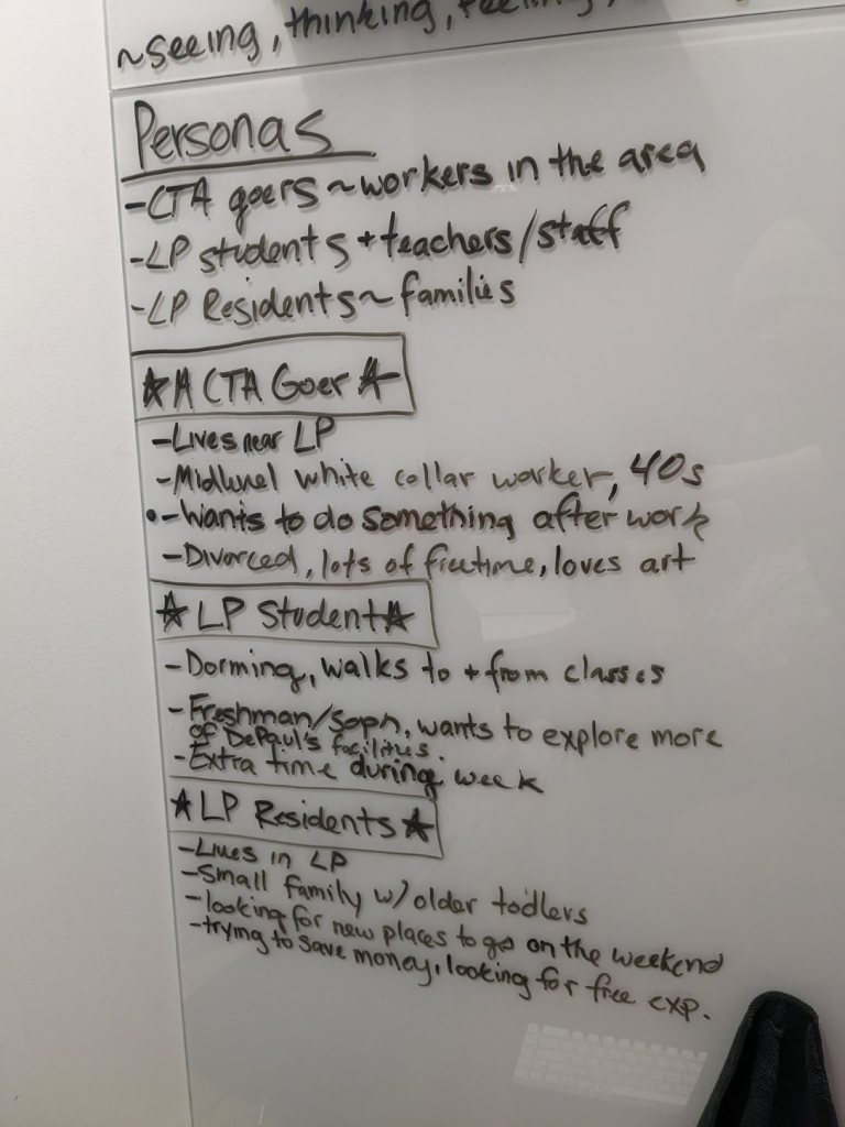
Over time, a more refined picture of who we were designing for emerged, and some of the ideas began to take a more firm shape. These people included:
- John Shaw, a 20 year old DePaul University student who desires for fun things that don’t cost money. He wants to feel immersed in new art experiences and to see art from diverse creators, but has limited time and budget.
- Tom March, a 50-year-old Lincoln Park resident who wants to explore Chicago. He’s a teacher who wants to share the knowledge of art with his peers and students, but he’s aware that fun educational experiences cost money.
- Tamara Parker,
Pitch #2
The second pitch to DPAM was conducted over Zoom, and it mainly consisted of us asking questions on whether or not a certain thing was okay. As we had gone through our idea, we asked questions. Mainly, the thing we found out was
Finalized Ideas
Pivoting One Last Time This Quarter
Our final pivot was based on the feedback we received in our second pitch, and involved some major changed. First, we could not longer utilize the banners on the side of the building because these things were decided about 2 to 3 years in advance; they already had a designer lined up, so it was a risky move to even design for it.
The eventual design we would design on would be consist of two portions. The first portion would consist of a series of footsteps leading up to the entrance, which would then have the projector inside. The projector would have been placed on the door, displaying information about the museum as well as pieces from the permanent collection.
This was a challenging and interesting idea which required media players, which would allow for media to be interchanged consistently.
Prototyping and Testing
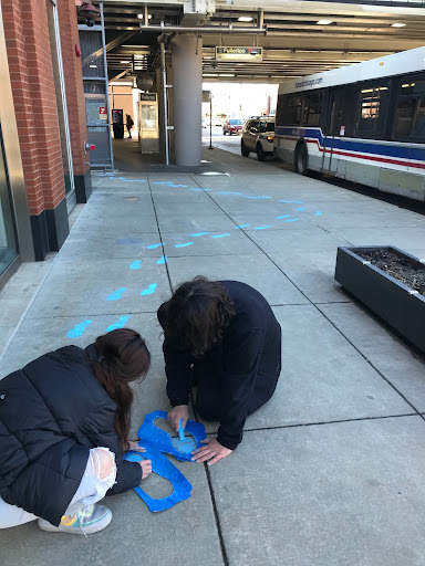
Our prototyping began in wintry wet weather, which allowed some members of the group to put down some large black footprints in front of the DPAM. This was carried on without me, so I only have the photos from it; however, from the testing, it appears to have been an interesting experiment.
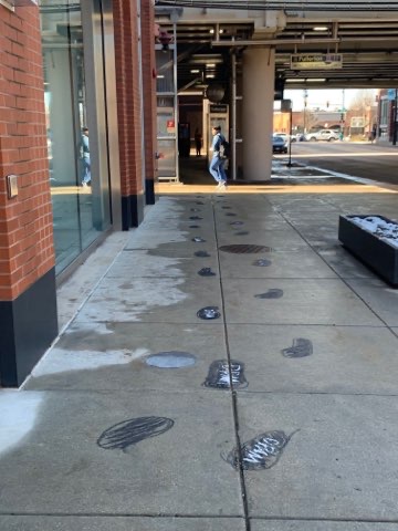
Out of the 26 people who passed by the museum on that day, 6 noticed the steps. As of the debrief, we decided to shift to increasing the color contrast between the footsteps on the concrete. This led to another round of testing on another day. The museum was closed on that day, given that it was setting up another exhibit, but it was still the day we tested.
The day wherein we did this testing was beautiful, almost perfect weather. We started out utilizing a piece of tape to create a stencil for some blue chalk, which would eventually result in a series of beautiful blue footsteps that surrounded the DPAM.
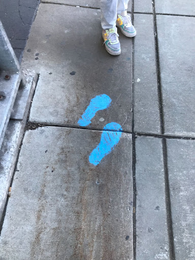
While testing this prototype with one of my group members (we tallied up how many people walked by and noticed the footsteps), I raised the notion of control data. Before these two tests, we had no indication that the footsteps would be even matter to how many people looked past the museum. We needed something to compare it to.
Gathering Control Data
The process of
User Journey
Our Final Pitch
The reaction to our final pitch, after it was over, was basically “Well, that went better than expected”. Unlike in the previous pitches, none of our ideas had been shot down. The traffic paint was approved, the projection upon the back was approved. Now, we had a break. But it wouldn’t be long before we were back in the fray.
Spring Quarter
In Spring Quarter, we were thrown a curveball. The budget which had been allocated for the DPAM had been cut in half, so the projects of the entire class had to adapt to this new variable. Some projects were no longer viable, but ours was still on track. We exited the final pitch of last quarter with confidence, but we needed to bring down the budget of the project by ejecting some elements of the project that had been pitched in Winter Quarter.
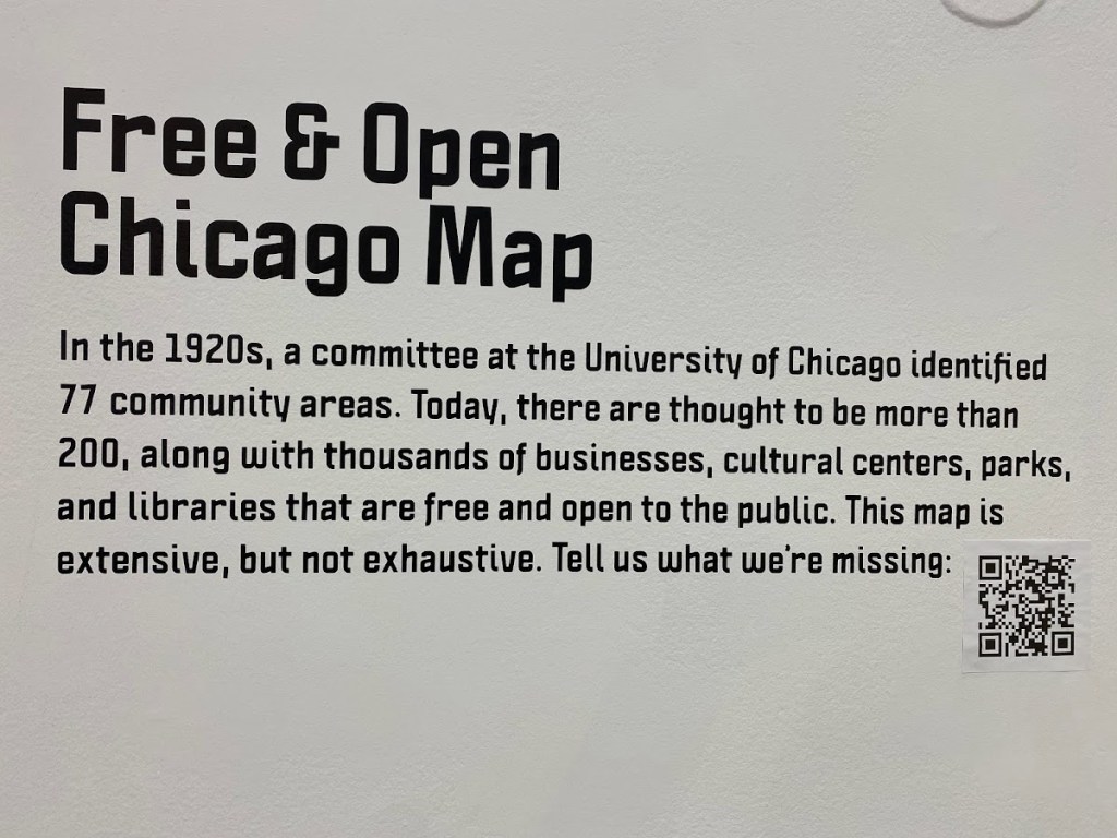
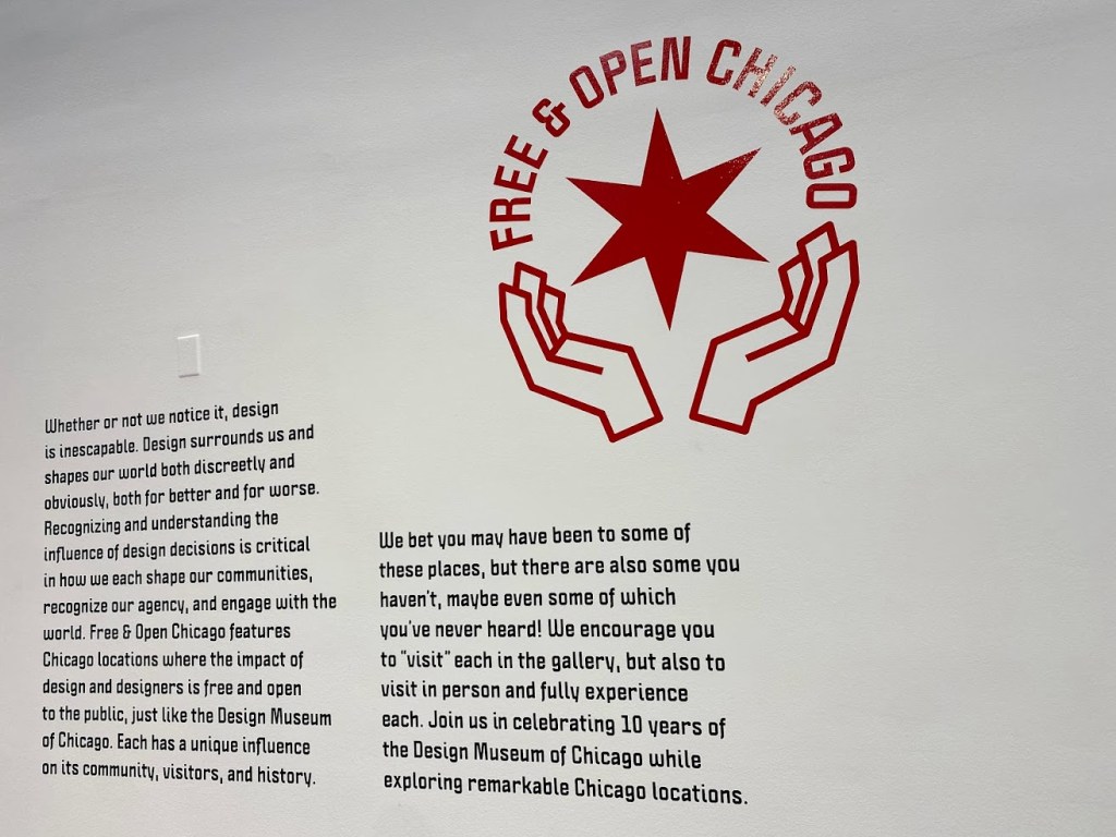
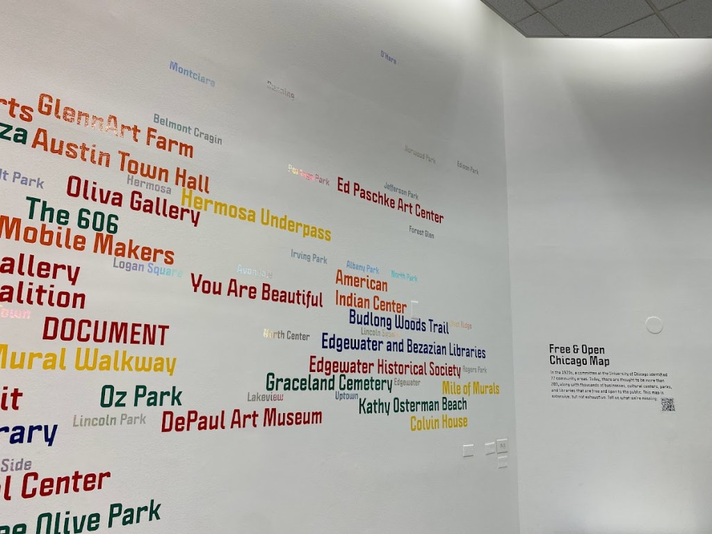
Not everything was bad, though. Recently, the Museum of Design in Chicago had opened up a map to illustrate all the places in chicago that were free and open to everyone. They also had a logo to go along with it, something that we decided to incorporate into our design.
Another Way
The first thing that was not going to work was the projector, which was already falling apart without the curveball of cost. A projector located above the door would be vulnerable to the elements, important in a city like Chicago wherein the weather can get both obscenely hot and obscenely cold.
The important part of having something on the vestibule wall was to draw people at the door in, so we needed to replace the projected image with something at least as visually interesting, but not as expensive. To solve this problem, we decided to design an optical illusion on the wall, which would provide an incentive for a person to step inside the building.
We decided to keep the vinyl footsteps as part of the project, tying it all together. I suggested that we test the durability of the vinyl footsteps by making a mold out of plaster of paris, submerging that in water, and then sticking it on the
Some of the illusions that I floated include a pinna wheel, which would be far more dynamic and moving:
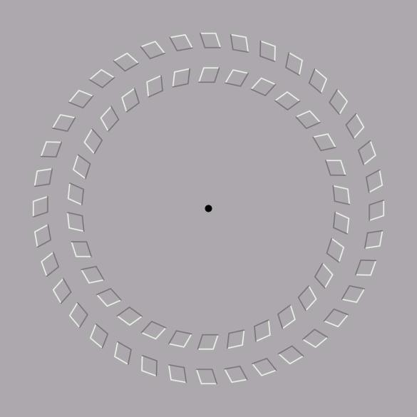
However, my fellow group members were not a huge fan of this. They were more partial to illusions such as this:

For our eventual testing, we would take inspiration from this sort of illusion to create a beautiful prototype. But first, we needed to collect that control data.
Control Data
Over the next few weeks, we collected control data. My observation took place on April 10th, from 11:00 AM to 12:00 PM. It was 64 degrees outside and mostly sunny, the density of people was sparse, and it was Dyngus Day. I specifically looked up if there were any observances taking place on that day while I watched, and Dyngus Day was one of them. I situated myself on the the left side of the building, and began to cont. 52 people walked past the museum; out of those 52 people, 17 looked at the museum. Nobody walked in.
Another person in the group recorded their data on the 5th, from 12:45 to 1:45 PM. It was 55 degrees and sunny, and it was an about average crowd with occasional spurts from the CTA. They recorded about 90 people; out of those 90 people, 45 people looked at the building. They noticed a younger couple walk in, spend 15 minutes in there, and walk out.
Testing The Prototype (Again)
Before the testing could begin, we first needed to gather the materials. We would need around 30 footsteps of vinyl to cover the entire length of this portion. What happened in the intervening period was creating the vinyl footsteps, using the DePaul University IRL labs and some designs we got off the internet.
A Single User Flow
We got in a bit of trouble after the user testing. Since we left up the installation, the DPAM had to take it down, and there was some electrical tape that left some sort of thing behind.
Final Presentations
