An Unsolicited Redesign by Drew Hesler, Skyler Zao, and Andy Lin
Executive Summary
Our redesign of the app is called “YouTube Lite” which is a much simpler version of YouTube. In our interviews, a few people stressed that YouTube was cluttered with a lot of extraneous features that hampered the experience of using the platform. Things like ads, popups about “Try YouTube TV, free for 30 days,” cast, voice commands, etc., were all features that were rarely used or found
annoying by the interviewees. Not only that, but another issue we came across was that one interviewee did not know how to full-screen her videos since she did now know the visual language of video players.
With this feedback, we decided to make it so that none of the extraneous features are within the app. We looked at the home page which has a lot of features such as SEO keywords, notification bell, cast, and account profile. These are some unnecessary features that our interviewees thought of, as they like a very simple look and just use this app for one simple function: to watch videos. For example, on the home and search results page, the SEO keywords pop up on the top of the screen. They are easy to misclick and are rarely used, especially on the search results page since they are usually irrelevant. There’s also the “voice command” feature present on the home and search results page. This feature is unnecessary since everyone already types out their search words, and is efficient to use since the search bar already offers suggestions when you type out words. For the video page, we made the video play in full screen automatically since many users already watch the videos on full screen, and we wanted to make the video player simpler by removing the extra step of full screening the video. We also removed a lot of features such as autoplay, cast, report, and help feedback. However, we still included important features such as quality, captions, and playback speed all in one pop-up menu making it as simple as possible while still providing the useful features that our interviewees use.
This whole redesign of the UI of YouTube has one goal: making it simpler for our users. It makes it easier for our users to interact with the app and easier to understand while still providing useful features.
PERSONAS
Henry X.

Male, 25, Seattle, Single, No kids
“Functional programming languages are the future!”
Henry is a back end software developer. He spends most of his day in front of his computer. He enjoys playing video games and going to arcade bars with his friends in his spare time. He definitely has a coffee addiction and likes finding new ways of perfecting his morning cup of joe.
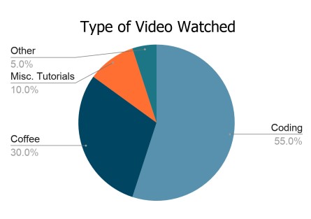
Goals and Needs: Wants to find videos to learn more programming languages and functions for those languages to stay on top of his game as a software developer. Prefers videos with detailed descriptions of the material being taught so he can see if the video is relevant to his needs. He also wants to browse videos efficiently to learn more about coffee and how to make his daily cup of coffee better.
Frustrations: Notifications aren’t useful at all on the YouTube app, so he turns them all off. Some of the functions on the app are annoying, especially the way accidentally wanting to comment on a video locks the screen, or the irrelevant YouTube recommendations.
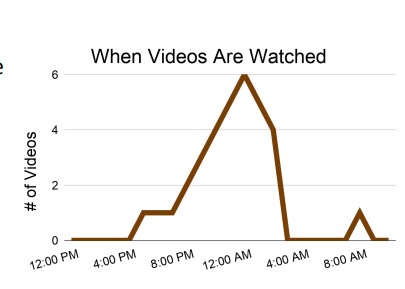
Behaviors: Uses the app when he’s not at his desk, mainly at night when he’s ready to unwind. Usually has a specific purpose for watching YouTube videos, so he searches for what he needs and watches only what he needs. Thus, he isn’t easily swayed to watch
recommended videos unless they are extremely relevant to his purpose. He also uses the YouTube app as a convenient way to watch videos his friends link him to.
Scenario: The thought of a moka pot brushes Henry’s mind, and he wonders if it would be good to use for his morning cup of coffee. He opens the YouTube app, searches up “moka pot demonstration”, and taps on the most relevant video he can find on the first few search results. He then skips to the relevant parts of the video, the demonstration, then watches the rest of the relevant content.
Jonathan M.

Male, 52, Greendale, Married, Two Children
“Playing music is one of the most important parts of my
day.”
Jonathan is an accountant at a corporate firm by day. However he is a practicing musician at night, playing weddings and gatherings along with his band. Alongside that, he provides services as a music tutor. He specializes in guitar and piano.
Goals and Needs: Needs access to a large variety of music and music tutorials in order to learn how to play anything that he is asked to play, with playback features to help his learning process.
Frustrations: While he is more technologically literate than many other people his age, there are still quite a few things that Jonathan is frustrated from when it comes to using YouTube. The ability to fully expand the screen is something he knows how to do, but still has trouble with due to his poor eyesight. Not only that, he has trouble knowing whether or not he is signed into the app using his Google Account.
Behaviors: When learning music, Jonathan will often use the YouTube playback features to slow up or slow down the tempo of the music. He will often replay the same video over and over again in order to learn a specific song. He does not tend to explore the
recommendations that the algorithm gives him, and will choose specific songs to practice. He also tends to practice his music very late at night, when his kids are fast asleep.
Scenario: Jonathan is asked to play a song for a wedding. He goes to YouTube and types in the name of the song in order to access the recordings of these things. Jonathan selects a recording from one artist, but opens another tab wherein there is a recording of the same song by another artist. From there, he uses the playback features to slow down and speed up the song to make it easier to learn.
Current Task Flow and Screenshots
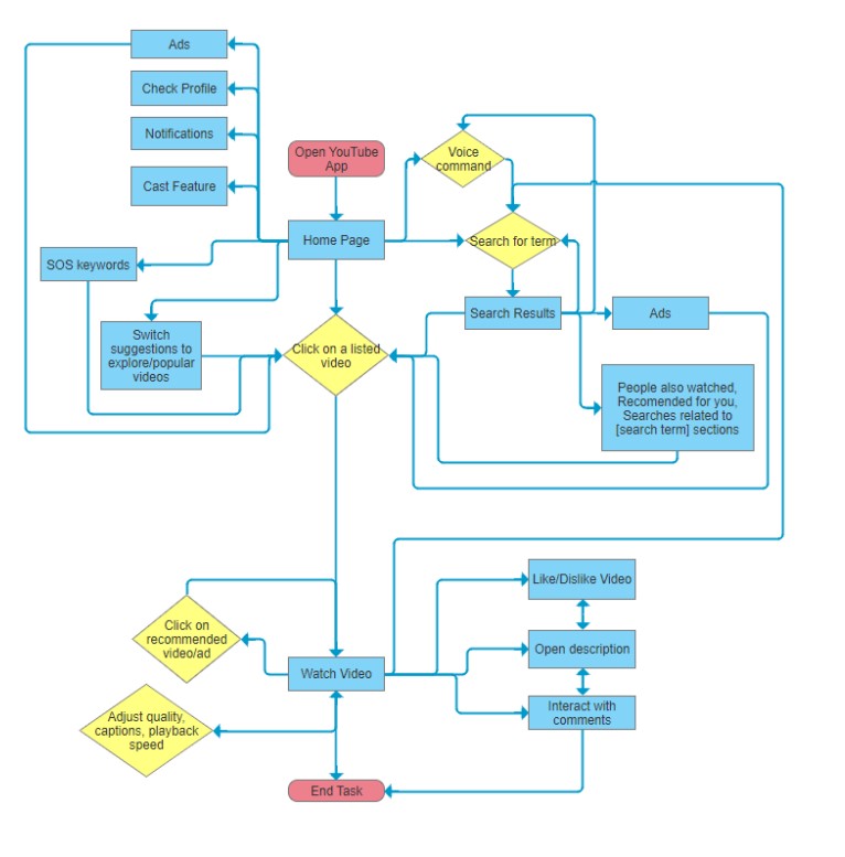
Current Task Flow
Current Task Screenshots
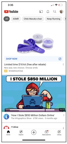
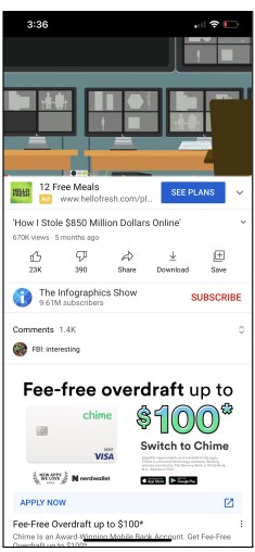
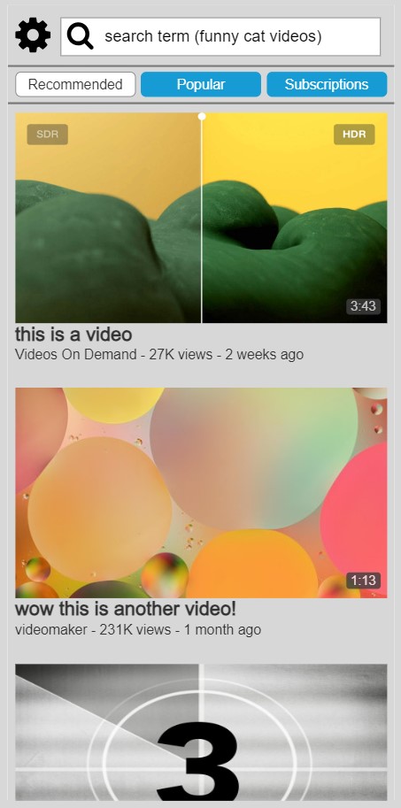
Home Page
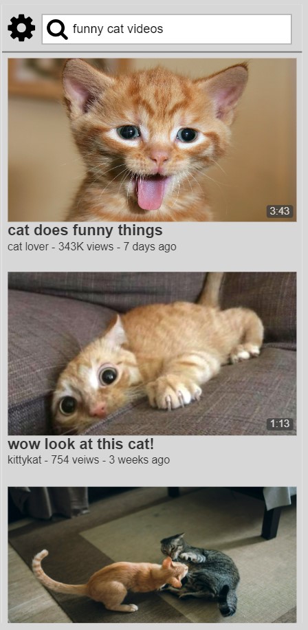
Search Results Page

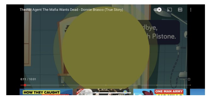
Video Page
Full Screen Video Page
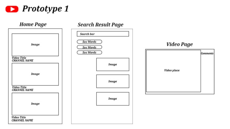
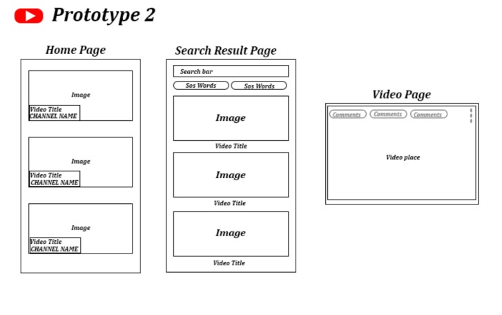
Low-Fidelity Prototypes
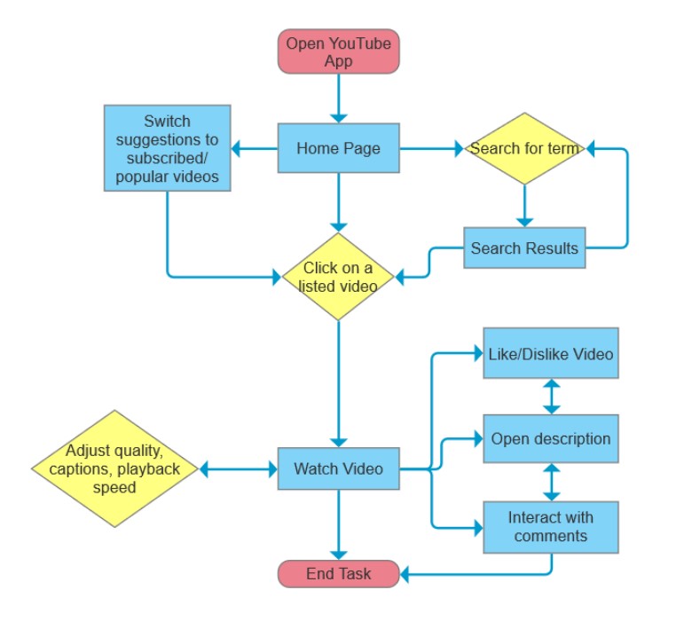
Redesigned Task Flow Chart
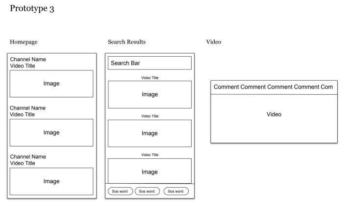
Page 1 – Home Page
● Videos are shown in a very clear and concise manner
● The user can switch the video suggestions by tapping on whether they want recommended, popular, or subscription tabs (not programmed in the prototype).
● We removed many features of the top bar and removed the bottom bar from the stock app, leaving just a settings button and a search bar in the top bar.
● Even though there were several complaints about YouTube’s recommendation algorithm suggesting irrelevant videos, we decided to keep it as we still wanted
to keep a landing page for indecisive users to browse videos from. We hope YouTube has a better recommendation algorithm in the future.
Page 2 – Search Page
● The layout is very similar to the home page since we removed many features of the search page present in the stock app (such as voice command, cast, and unrelated search results) and just wanted to show videos relevant to the search results and nothing more.
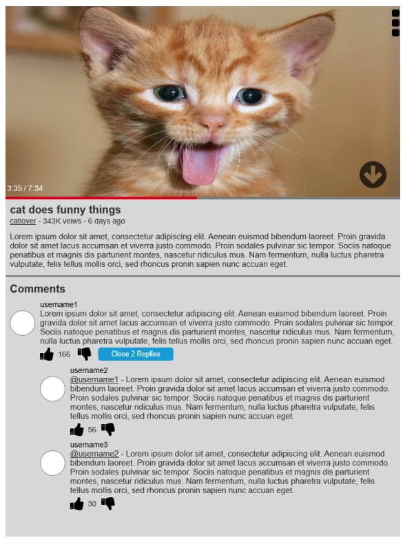
Page 3 – Video page
● The video will open full screen to the video’s orientation (usually
landscape).
● Users can scroll down or tap on the down arrow button on the video player (as a signifier for those who are not familiar with
this app) to read the description and interact with comments. (It might take a couple of clicks to work properly in the prototype.)
● To go back to the video, there will be a scroll to top
arrow button that appears when the page has been scrolled down (not shown here, but interactive in the prototype)
● Users can also adjust video settings like quality, captions and playback speed by pressing on the three dot button on the top right to open up a menu.
